Hiraal Brand

Hiraal Lifecare · Typography

Typography

Lifecare inherits the Group's pair unchanged: Schibsted Grotesk for display, Inter for everything else. The wordmark itself is artwork in Objektiv Mk1 and is never typed.

Typefaces

Two typefaces, one job each. Both are open-licence; download the packages below or install from Google Fonts.

Aa

Schibsted Grotesk

Display and headings

Google Fonts (opens in a new tab)
  • Hiraal LifecareSemiBold600
  • Hiraal LifecareBold700

ABCDEFGHIJKLM NOPQRSTUVWXYZ
abcdefghijklm nopqrstuvwxyz
0123456789 & ? ! @ % — “ ”

A free app for recording blood pressure, blood sugar and weight at home, and seeing how they change. Compatible home monitoring devices are optional and sold separately.
Aa

Inter

Body and interface

Google Fonts (opens in a new tab)
  • Hiraal LifecareRegular400
  • Hiraal LifecareMedium500
  • Hiraal LifecareSemiBold600

ABCDEFGHIJKLM NOPQRSTUVWXYZ
abcdefghijklm nopqrstuvwxyz
0123456789 & ? ! @ % — “ ”

A free app for recording blood pressure, blood sugar and weight at home, and seeing how they change. Compatible home monitoring devices are optional and sold separately.

The full scale, weights and rules for the pair are on the Group typography page.

Weights

Five weights across the two faces. Nothing lighter than Regular, nothing heavier than Bold.

Hiraal Lifecare

Schibsted Grotesk SemiBold600Section headings

Hiraal Lifecare

Schibsted Grotesk Bold700Page titles, display

Hiraal Lifecare

Inter Regular400Body text, readings

Hiraal Lifecare

Inter Medium500Captions, table data

Hiraal Lifecare

Inter SemiBold600Labels, buttons

In the interface

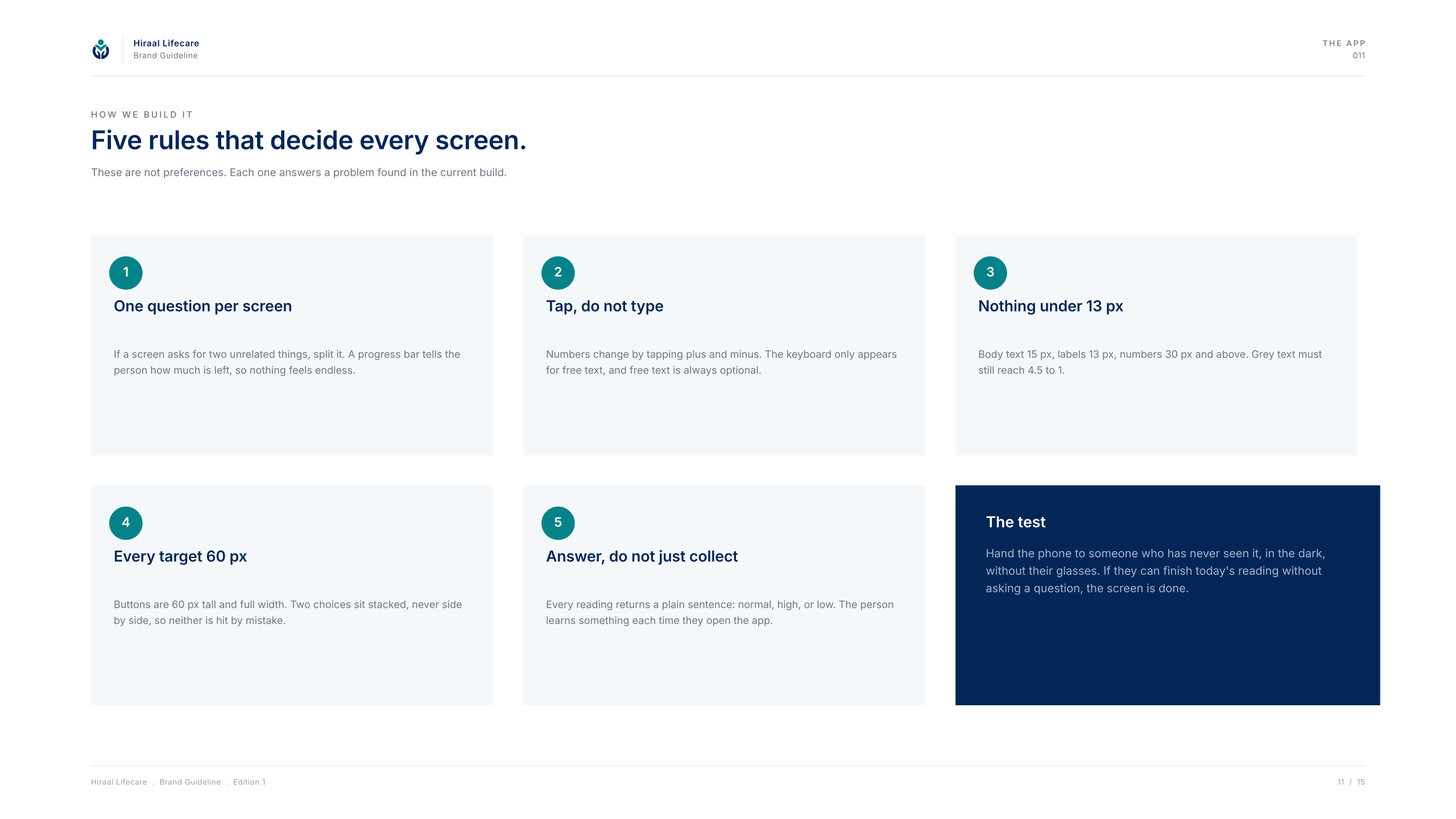
Board 11 — “Five rules that decide every screen.” Type in the app is set for one reading at a time, large enough to be read at arm's length.

Page 11 — the five rules for every screen.
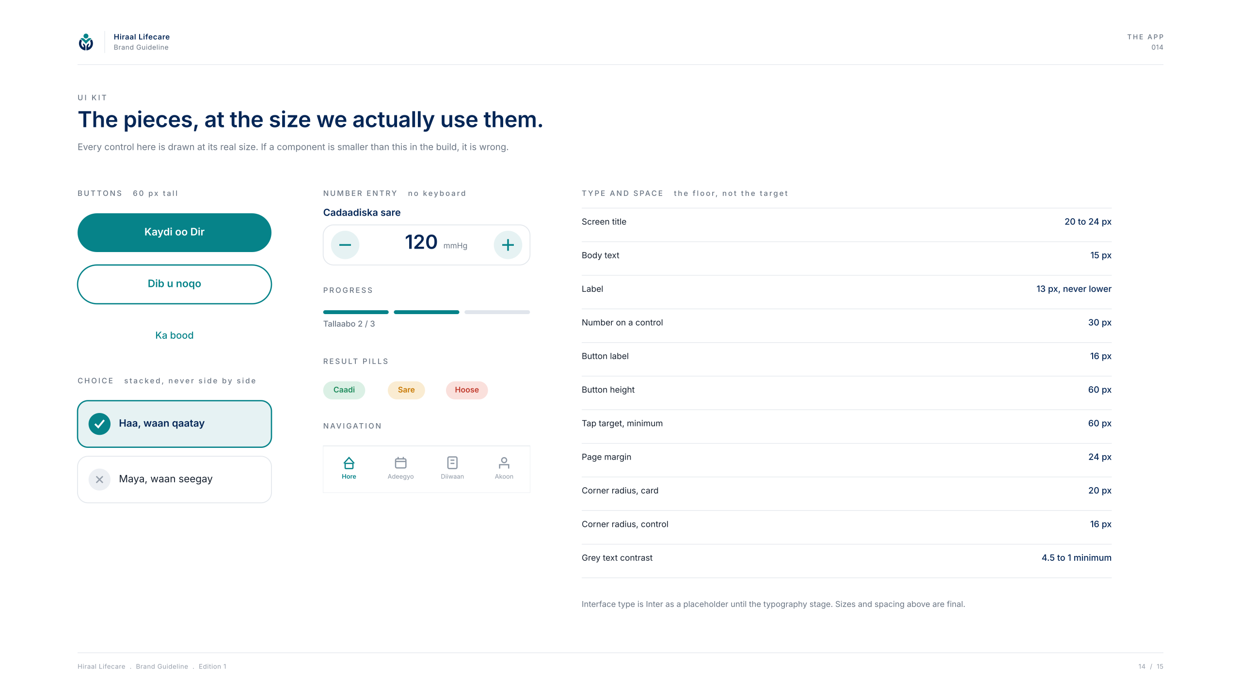
Page 14 — “The pieces, at the size we actually use them.” The UI kit: type sizes, buttons and fields at the sizes the app uses.

Rules

Do

  • Schibsted Grotesk for display, Inter for everything else — the Group pair, inherited.
  • Navy carries structure; teal marks every action.
  • One question, one reading, one screen.

Don't

  • Teal text on navy.
  • A third typeface.
  • Retyping the wordmark in either face — it is artwork.